How the Mweb Mobile App Is Laid Out
Once you’re logged in, the app is designed around two main navigation areas:
- The dashboard
- The menu and bottom navigation bar
Knowing what lives where saves time and frustration.
Navigating the Mweb Mobile App
Once you’re logged in, the app is designed around two main navigation areas:
Knowing what lives where saves time and frustration.
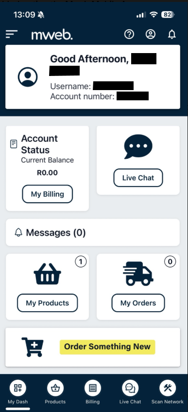
The dashboard is the first screen you see after logging in. From here you can quickly access:
Think of this as your control centre.
The bottom navigation bar is always visible and gives you quick access to key areas:
This is the fastest way to move around the app.
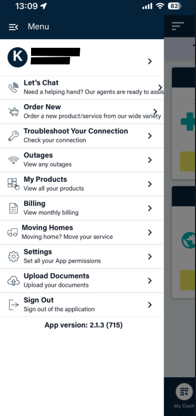
Tap the menu icon to open the full list of options. From here you can:
This menu is where less frequent but important options live.
You can move between sections at any time using:
There’s no need to go back to the dashboard every time.
Once you’re logged in, the app is designed around two main navigation areas:
Knowing what lives where saves time and frustration.
©Mweb (Pty) Ltd. All rights reserved.